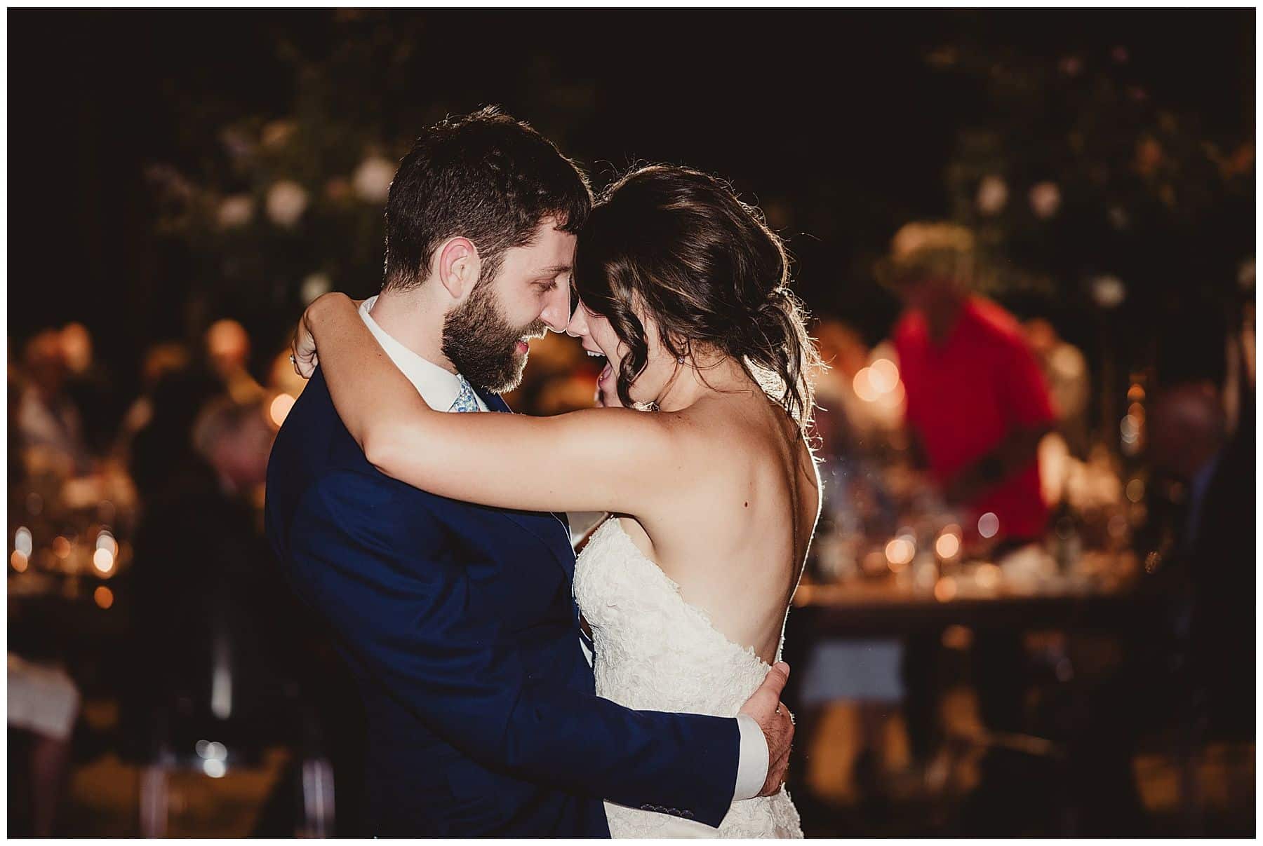
Wedding Color Schemes: Why They Matter
Color isn’t just a detail—it shapes the entire atmosphere of your wedding celebration. Whether you’re dreaming of neutral, earthy hues or bold, dramatic tones, the color scheme you choose will influence everything from décor to photography. Let’s explore why color coordination is crucial and how you can make it work seamlessly throughout your event.
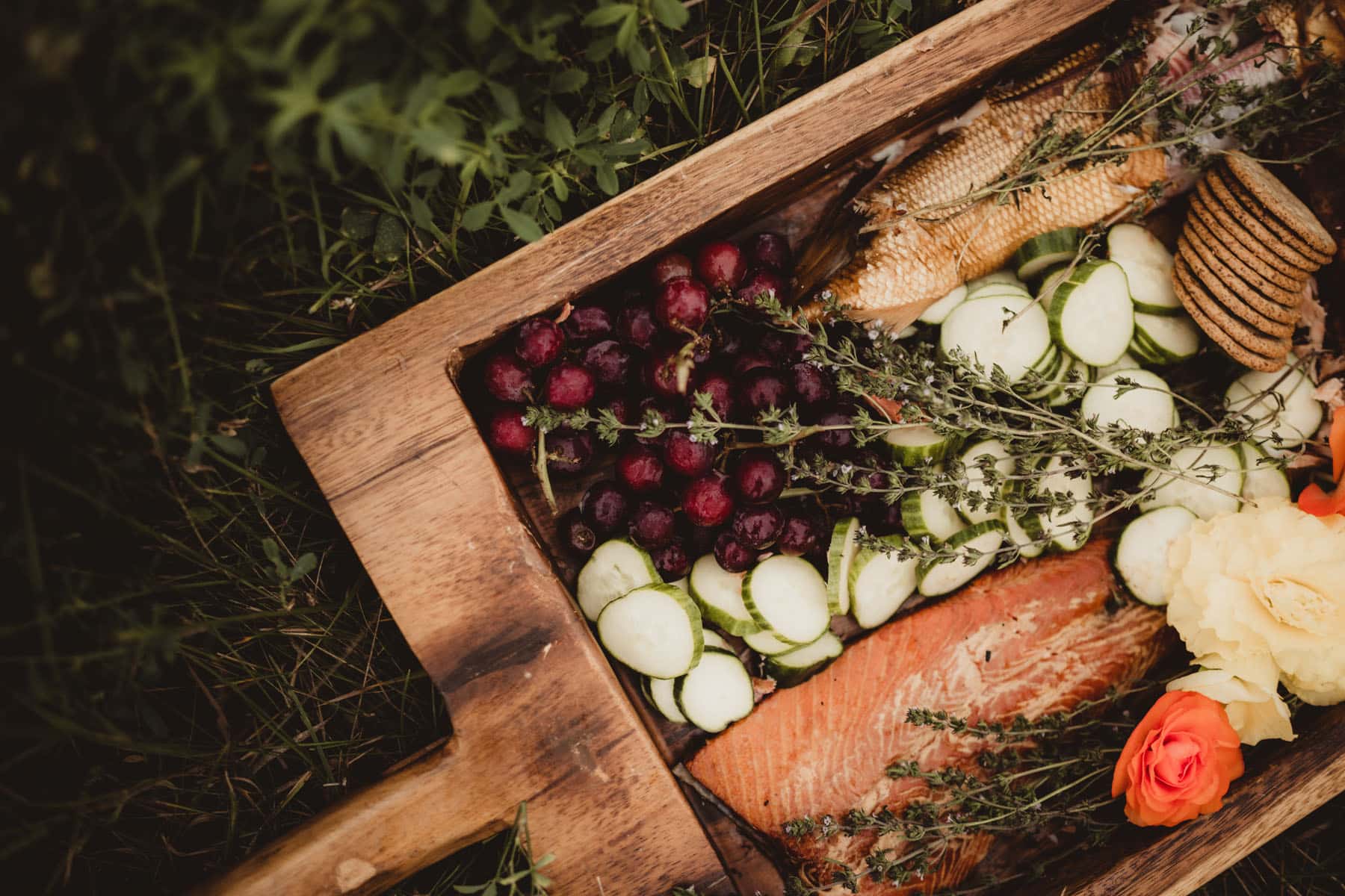
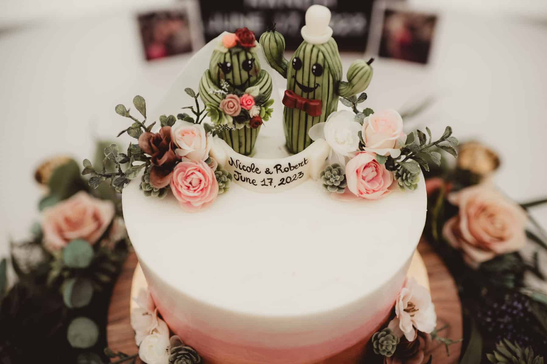
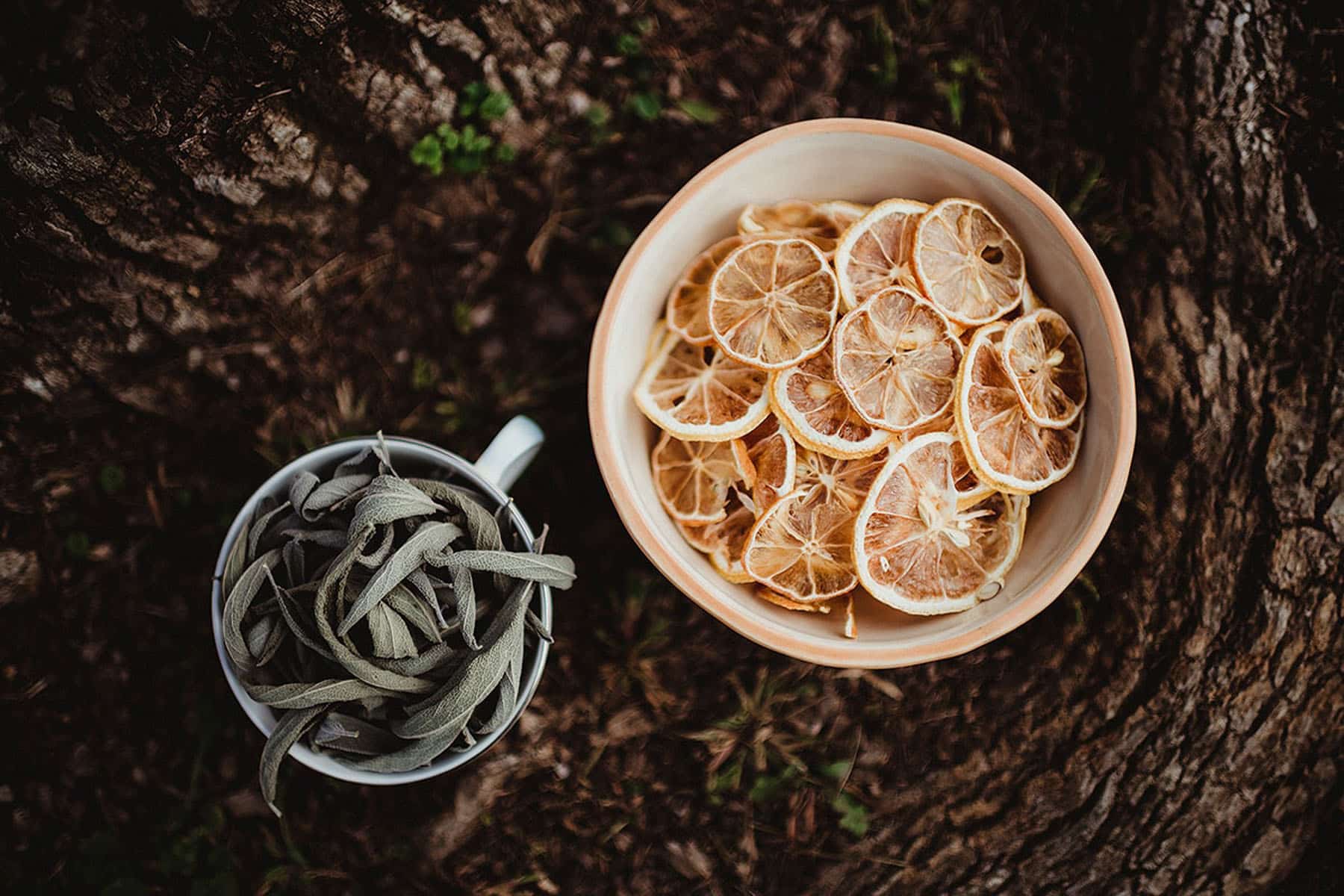
Why Wedding Color Schemes Are So Important
Color sets a mood. For instance, bright oranges and pinks can energize a room, while soft neutrals and pastels create an intimate, romantic vibe. As photographers, we see firsthand how certain combinations translate into captivating images that reflect your personality and vision. So, if you’re drawn to a specific look—modern minimalism, rustic charm, or vibrant festivity—your wedding color scheme is the bedrock that ties it all together.
- Consistent color schemes simplify countless decisions, from floral a3333223rrangements to bridesmaid dresses.
- Shades of the same family or complementary tones can unify the entire wedding day without feeling monotonous.
Matching Your Wedding Color Schemes to a Photographer’s Style
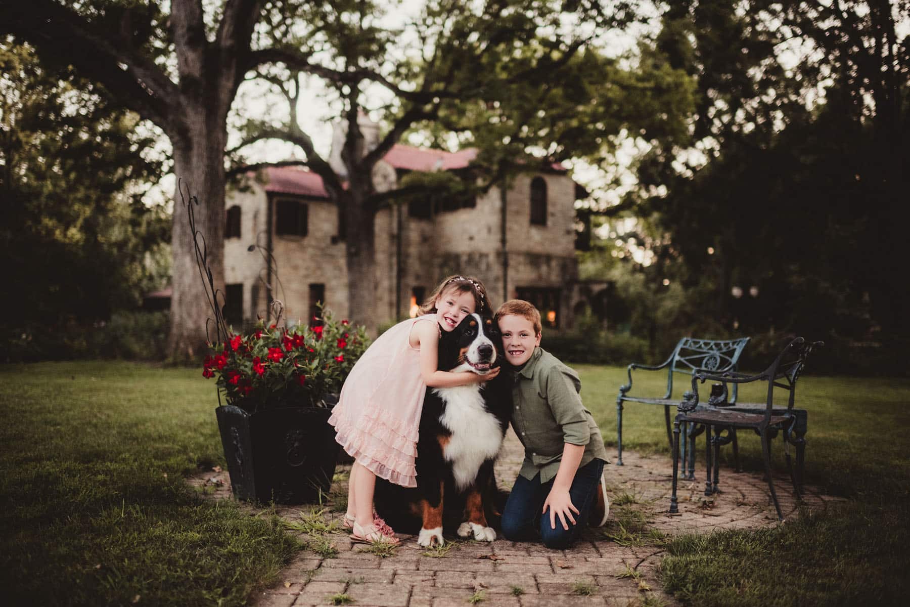
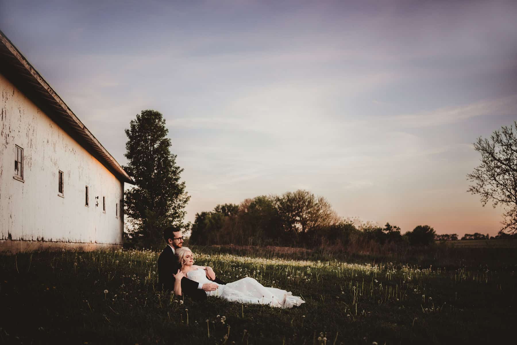
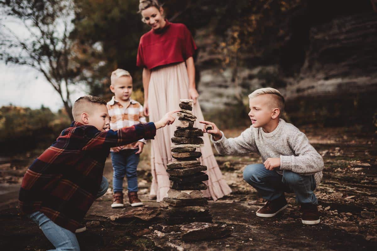
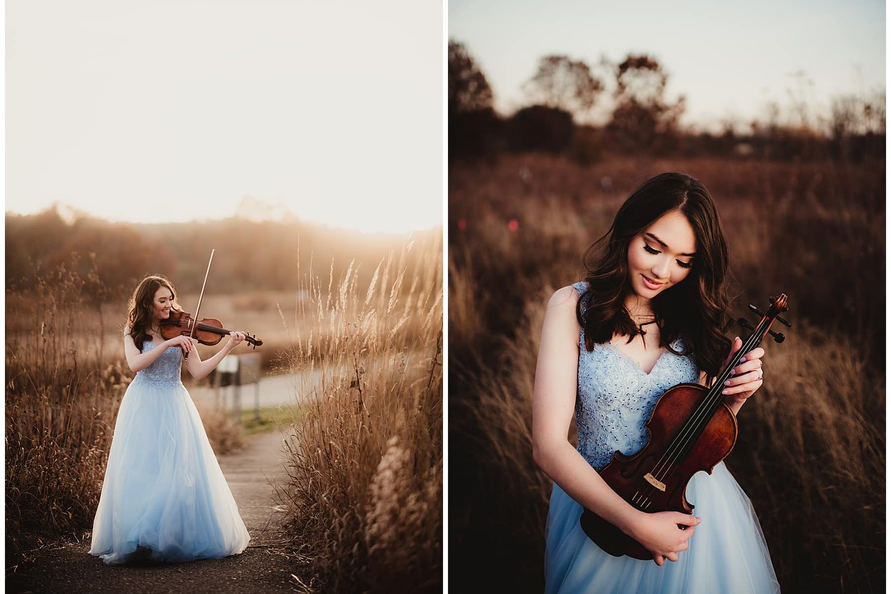
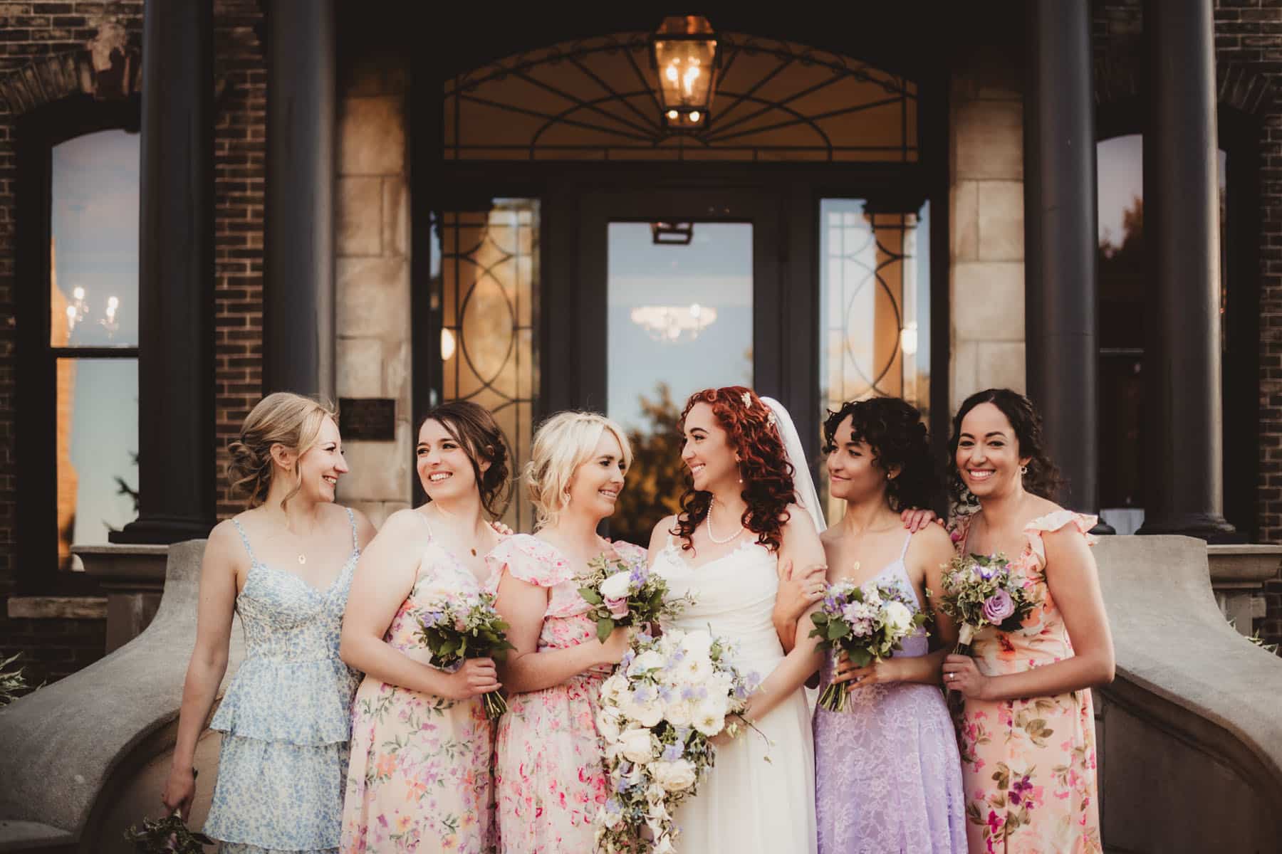
Every photographer has a signature style. Some specialize in light and airy images, while others embrace rich, moody tones. If you adore bright purples and yellows, make sure your photographer’s portfolio showcases vibrant, dynamic photos. On the flip side, if you gravitate towards muted taupes, creams, and dusty blues, look for a photographer whose work leans soft and understated.
- Don’t expect a dark-and-moody photographer to suddenly produce a bright, pastel aesthetic—and vice versa.
- When browsing portfolios, pay attention to how different color schemes appear. If you love it, chances are you’ll love your own results, too.
Wedding Attire and Coordinating Colors
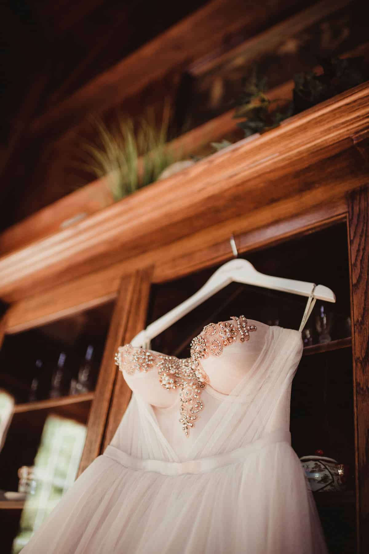
Gone are the days when everyone wore a uniform color or style. Now, you can mix and match shades, patterns, and cuts to reflect your personality. The key is balancing your choices so they stay true to your overall wedding color schemes.
- Fit is everything. No matter the color or style, poor tailoring will show in photos.
- Consider your season and venue. Muted pastels might look out of place at an outdoor winter ceremony, just like heavy velvet suits might be too warm for a mid-summer affair.
Florals That Complement Your Wedding Color Ideas
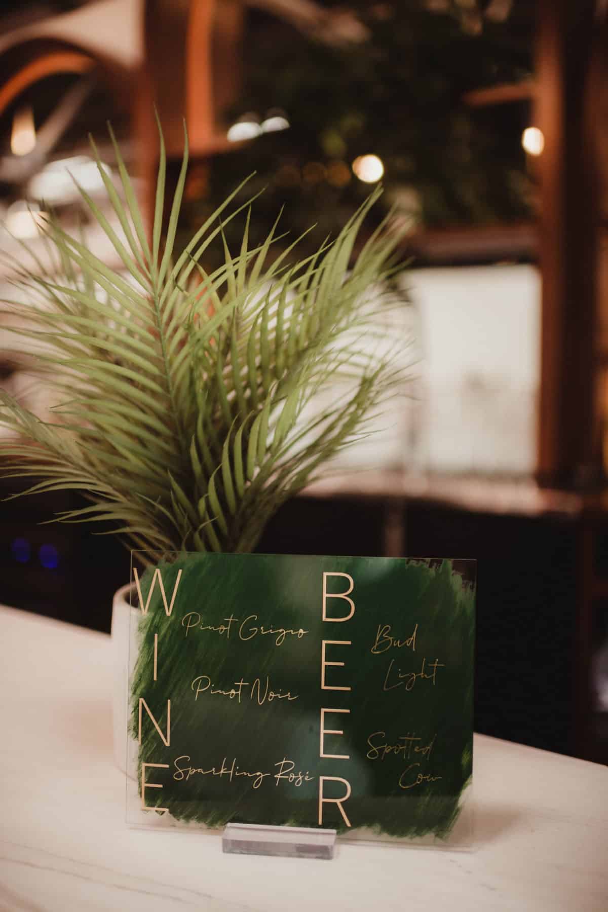
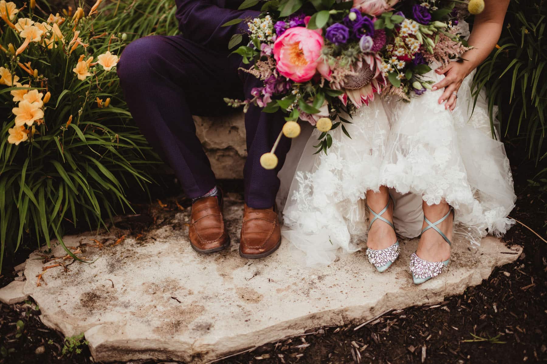
Florists can be incredibly versatile, but each one has their own niche. Some excel in lush, wild arrangements featuring seasonal blooms, while others craft elegant bouquets with classic roses and greenery. Be transparent about your color preferences so they can recommend flowers and foliage that harmonize with your scheme.
- Seasonal flowers are often more cost-effective and look healthier.
- Greenery or unexpected textures can help anchor your palette and add depth to your photos.
Décor, Atmosphere, and the Time of Year
A wedding planner or event designer can help you blend your chosen shades with the season, venue, and décor. Even if you’re doing it all yourself, remember that certain colors align better with specific times of the year. Deep jewel tones might feel off during a bright spring gathering, whereas pastel pinks could seem misplaced in a fall setting.
- Love a color that doesn’t match your season? Use it as an accent. For example, add pops of pale pink in a fall palette with richer undertones.
- Think about lighting. Warm uplighting can enhance earthy, moody schemes, while cooler tones can complement a modern, minimalist vibe.
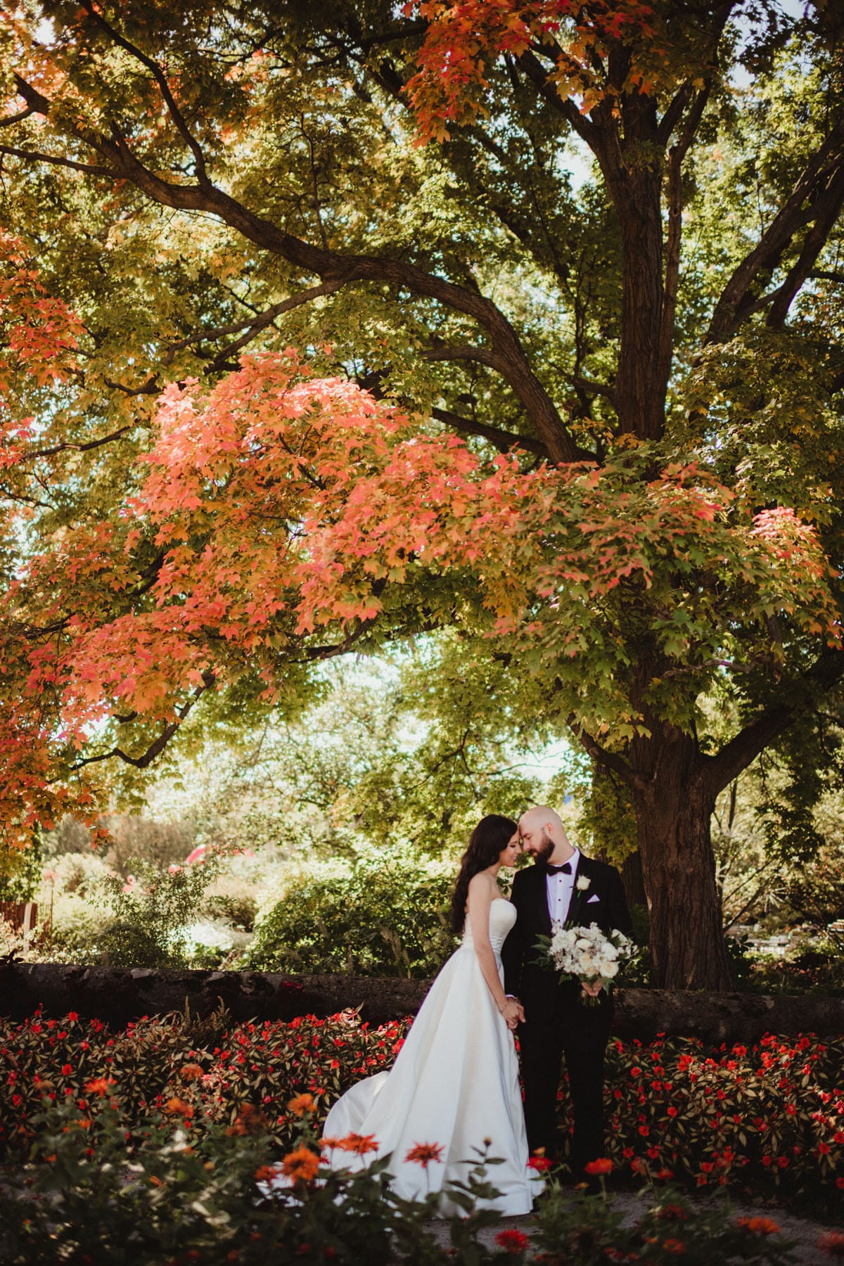
Extra Tips for a Flawless Wedding Color Scheme
- Invitations & Stationery: Showcase your color palette in your save-the-dates or invitations to give guests a sneak peek.
- Layered Looks: If you love multiple colors, work them in through subtle elements—bridesmaid dresses, ties, linens, or floral accents.
- Inspiration Sources: Check out wedding color scheme ideas from The Knot or browse our Pinterest boards for creative mixes.
Final Thoughts on Choosing Wedding Color Schemes
Your wedding color schemes are the unifying thread that weaves through every aspect of your celebration – from attire and florals to décor and photography. The goal is to choose shades that resonate with your personality and setting, ensuring a cohesive yet exciting aesthetic. Whether you opt for timeless neutrals or a kaleidoscope of vibrant hues, let your colors tell the story of who you are as a couple.
Are you eager to see how we can capture your unique color scheme? Contact us! We can’t wait to help you showcase the colors that make your wedding unforgettable.
